Having a compelling Etsy shop banner is key for attracting potential customers and establishing a strong brand presence on the platform. Your shop banner is one of the first visual elements visitors encounter when they land on your Etsy shop page. It serves as a virtual storefront, creating a lasting impression and enticing visitors to explore your products.
A well-designed Etsy shop banner can convey your brand’s personality, showcase your unique style, and create a sense of professionalism. It helps you stand out from the competition and gives customers a glimpse into the type of products or services you offer. A visually appealing banner can also build trust, encouraging visitors to stay longer on your shop page and increasing the likelihood of conversions.
Introduction
In this article, we will guide you through the process of creating an eye-catching Etsy shop banner. We’ll cover everything from planning and preparation to design techniques and optimization for different devices. By following these steps, you’ll be able to create a banner that effectively represents your brand and attracts potential customers.
Here’s a breakdown of what we’ll cover:
- Planning and Preparation: We’ll help you define your brand, set goals, and gather inspiration for your banner design.
- Designing Your Etsy Shop Banner: Learn how to choose the right dimensions, select high-quality images, incorporate brand elements, and create a visually appealing composition.
- Adding Text and Information: Discover tips for crafting a compelling message, choosing the right font, and ensuring readability.
- Enhancing with Graphics and Effects: Explore techniques to add overlays, textures, decorative elements, and special effects to your banner.
- Optimizing for Different Devices: Find out how to test and adjust your banner for different screen sizes, ensuring it looks great on mobile and desktop.
- Uploading and Updating Your Banner: Learn the steps to save, upload, and position your banner on Etsy, as well as the importance of regularly updating it.
- Promoting Your Shop with Your Banner: Discover strategies to showcase your banner on social media and leverage it for marketing purposes.
By the end of this article, you’ll be equipped with the knowledge and tools to create a standout Etsy shop banner that captures the attention of potential customers and reflects the essence of your brand. Let’s get started!
Planning and Preparation
Define your brand and target audience
Before diving into designing your Etsy shop banner, it’s essential to have a clear understanding of your brand and target audience. Your banner should align with your brand identity and appeal to your specific target market. Here’s how to define your brand and target audience:
Brand Identity – Determine your brand’s personality and values. Are you fun and quirky or elegant and sophisticated? – Identify your unique selling proposition (USP) – what sets your products apart from others? – Consider your brand’s color palette, fonts, and overall visual style.
Target Audience – Research your ideal customers. Who are they? What are their interests, demographics, and preferences? – Understand their needs and motivations. How can your products fulfill those needs? – Consider their visual preferences and the style that resonates with them.
By defining your brand and target audience, you’ll have a solid foundation to guide your banner design decisions.
Set goals for your banner design
Setting clear goals for your Etsy shop banner design will help you focus your efforts and achieve desired outcomes. Here are some common goals to consider:
- Capture attention: Create a banner that immediately grabs visitors’ attention and entices them to explore your shop further.
- Communicate brand identity: Ensure your banner reflects your brand’s personality, values, and style, conveying a consistent brand image.
- Showcase products or services: Use the banner to highlight your best-selling or most representative products or services, giving visitors a glimpse of what you offer.
- Establish professionalism: Aim for a polished and high-quality banner that enhances your credibility and professionalism.
- Differentiate from competitors: Find ways to make your banner stand out and showcase what makes your shop unique among similar offerings.
- Create a cohesive visual experience: Ensure that your banner aligns with the overall aesthetic of your Etsy shop, creating a seamless and visually pleasing experience for visitors.
By setting clear goals, you can tailor your design choices and create a banner that effectively meets your objectives.
Research and gather inspiration
Inspiration can be found in various sources and can help you generate ideas and refine your vision for your Etsy shop banner. Here’s how to conduct research and gather inspiration:
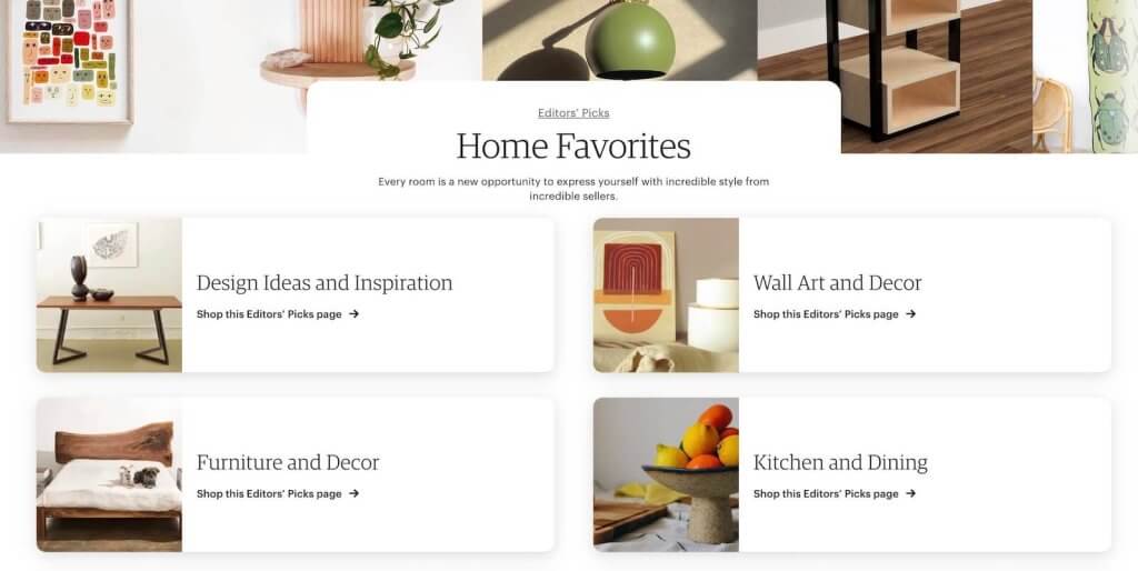
Explore successful Etsy shops: Look at established shops that align with your brand or cater to a similar target audience. Analyze their banners for design elements, composition, and messaging that catch your attention.
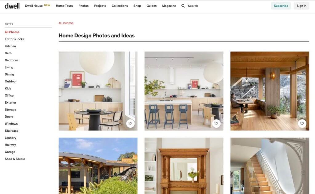
Browse relevant websites and blogs: Look beyond Etsy and explore websites and blogs related to your industry or niche. Take note of design trends, color palettes, and typography that resonate with your brand.
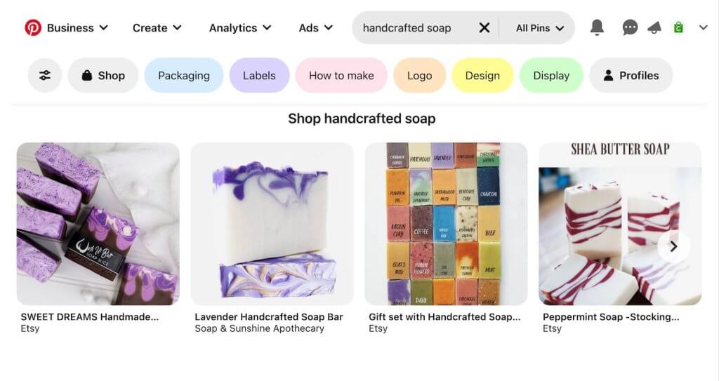
Utilize visual platforms: Use visual platforms like Pinterest or Instagram to search for keywords related to your brand or target audience. Save images or create mood boards that inspire you and reflect your desired aesthetic.
Look for design inspiration beyond your industry: Explore design trends in other fields, such as fashion, interior design, or graphic design. Sometimes, fresh ideas can come from unexpected sources.
Remember, inspiration should guide and inspire you, but always strive for originality and ensure that your banner reflects your unique brand identity.
By defining your brand and target audience, setting goals, and gathering inspiration, you’ll lay a solid foundation for creating an Etsy shop banner that effectively represents your brand and appeals to your target market.
Designing Your Etsy Shop Banner
Choosing the right dimensions
When designing your Etsy shop banner, it’s crucial to select the appropriate dimensions to ensure it displays correctly on the platform. The recommended dimensions for an Etsy shop banner are 3360 x 840 pixels for optimal performance, and a minimum of 1200 x 300 pixels. This size allows your banner to fit well across different devices without being overly large or distorted.
Graphic Design Tools for Creating Etsy Shop Banner Graphics
Creating an eye-catching Etsy shop banner requires the use of graphic design tools. Here are some popular tools that can assist you in designing your banner:
- Canva: Canva is a user-friendly online graphic design tool that provides templates, images, fonts, and customizable elements. It’s ideal for beginners and offers a wide range of features to create professional-looking banners.
- Adobe Photoshop: Adobe Photoshop is a robust image editing software used by professionals. It offers extensive capabilities for creating and editing graphics, including advanced photo manipulation and text customization options.
- Adobe Illustrator: Adobe Illustrator is a vector graphics editor that allows for scalable and high-quality designs. It’s suitable for creating illustrations, logos, and other graphical elements that can be incorporated
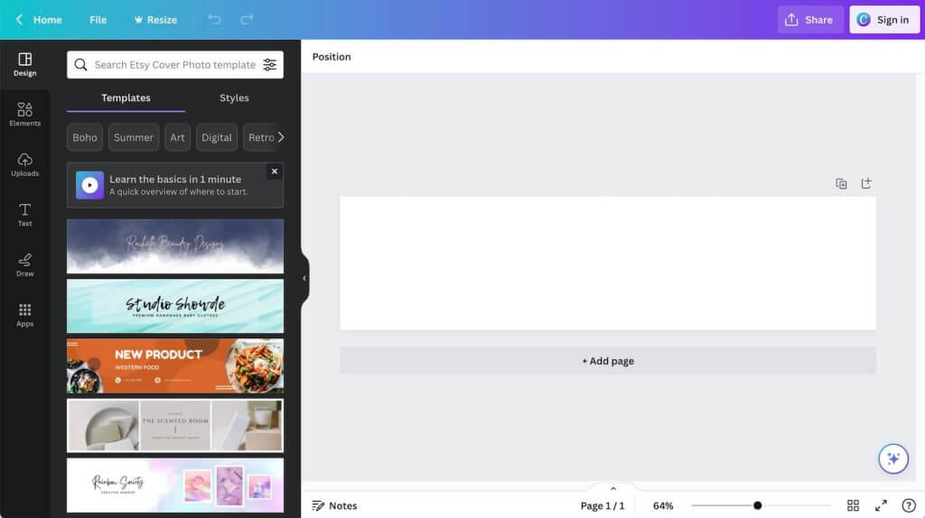
Canva has a lot of pre-made templates and resources you can use to create your Etsy shop banner and would be a good starting point if you’re not familiar with graphic design software.
Selecting high-quality images or illustrations
Visual elements play a significant role in creating an engaging Etsy shop banner. Choose high-quality images or illustrations that are relevant to your brand and products. Consider the following tips:
- Showcase your products: Feature high-resolution product images that represent your best-selling or most visually appealing items.
- Use lifestyle imagery: Depict your products in real-life scenarios or on models to help potential customers envision themselves using or wearing your offerings.
- Maintain consistency: Ensure that the images or illustrations you select align with your brand’s aesthetic, colors, and overall style.
- Consider professional help: If you’re not confident in your photography or illustration skills, consider hiring a professional to create visuals that truly elevate your banner.
Incorporating your brand elements
Your Etsy shop banner is an opportunity to reinforce your brand identity and make it instantly recognizable to visitors. Incorporate the following brand elements:
- Logo: Place your shop logo prominently in the banner to increase brand recognition.
- Color palette: Use colors that align with your brand’s visual identity. Consistency in color choice helps create a cohesive and memorable brand presence.
- Fonts: Select fonts that reflect your brand’s personality and are easy to read. Stick to one or two font styles to maintain visual harmony.
- Brand tagline or slogan: If applicable, include a short and catchy tagline or slogan that communicates your brand’s unique selling proposition or value proposition.
Utilizing typography effectively
Typography plays a vital role in communicating your message and enhancing the visual appeal of your Etsy shop banner. Consider the following typography tips:
- Readability: Choose fonts that are legible and easy to read, even at smaller sizes. Avoid overly decorative or intricate fonts that may hinder readability.
- Hierarchy: Establish a clear hierarchy in your text by using different font sizes, weights, or colors to guide the viewer’s attention to the most important information.
- Contrast: Create contrast between your text and the background to ensure it stands out. Use lighter text on a darker background or vice versa.
- Alignment and spacing: Pay attention to text alignment and spacing to create a visually balanced and professional look. Consider using grids or guidelines to help with alignment.
For more tips, read: Typography Elements Everyone Needs to Understand. Also checkout 99 Designs- Typography design 101: a guide to rules and terms.
Creating a visually appealing composition
A visually appealing composition is essential for an Etsy shop banner that captures attention and communicates your brand effectively. Consider the following composition techniques:
- Rule of thirds: Divide your banner into a grid of nine equal sections and position your key elements along the intersecting lines or at their intersections. This technique creates a visually balanced and pleasing composition.
- Focal point: Identify a focal point for your banner, such as your logo or a captivating product image. Position it strategically to draw attention and create visual interest.
- Negative space: Allow for breathing room in your design by incorporating negative space. This empty space helps emphasize your main elements and ensures the overall composition isn’t cluttered.
- Visual hierarchy: Arrange your elements in a way that guides the viewer’s eye through the banner. Place more important or attention-grabbing elements prominently, and use size, color, or contrast to establish visual hierarchy.
Adding Text and Information
Deciding on the message and wording
The text you include in your Etsy shop banner is an opportunity to communicate important information and connect with your audience. Consider the following steps when deciding on the message and wording:
- Identify your key message: Determine the primary message or call-to-action you want to convey through your banner. Is it a promotional offer, a brand statement, or a welcome message?
- Keep it concise: Craft a short and impactful message that can be easily read and understood at a glance. Avoid lengthy paragraphs that may overwhelm or confuse visitors.
- Be authentic and unique: Showcase your brand’s personality and voice through your wording. Stand out by using creative and original language that resonates with your target audience.
- Consider keywords: Incorporate relevant keywords or phrases that reflect your products or niche. This can help with search engine optimization (SEO) and attracting the right audience to your shop.
Choosing the right font and size
The font selection and size in your Etsy shop banner significantly impact its overall appearance and readability. Consider the following tips when choosing fonts:
- Match your brand’s style: Select fonts that align with your brand’s visual identity and personality. If your brand has a specific font associated with it, consider using that to maintain consistency.
- Contrast and legibility: Ensure there is enough contrast between the font and the background to ensure readability. Avoid using similar colors that may cause the text to blend with the background.
- Font combinations: Experiment with combining fonts to create visual interest. Pair a decorative or display font with a clean and legible font for headings and body text, respectively.
- Font size hierarchy: Establish a clear hierarchy by using different font sizes for different elements. Make sure the most important information, such as your shop name or tagline, is larger and more prominent.
Ensuring readability and legibility
To make your Etsy shop banner easily readable, consider the following tips:
- Test readability: View your banner from different devices and screen sizes to ensure the text remains legible. Avoid using small font sizes that may be challenging to read on mobile devices.
- Background contrast: Choose background colors that provide enough contrast with the text, ensuring it stands out and is easy to read. Try out the Color Contrast Checker to help with this.
- Whitespace around text: Provide enough whitespace or padding around the text to prevent it from feeling crowded or cramped. This improves legibility and gives your banner a clean, polished look.
- Avoid excessive effects: Be cautious with applying heavy text effects, such as shadows or glows, as they can hinder readability. Use these effects sparingly and make sure they don’t overpower the text.
Here are examples of graphic designs with too many effects and that are hard to read/have poor contrast. Notice how busy the layouts look and how hard it is to focus on the information that they’re trying to communicate.

Common color contrast patterns to avoid as they tend to be visually jarring:
- Red text/green background (vice versa)
- Green text/orange background (vice versa)
- Blue text red/background (vice versa)
Include important details like shop name and tagline
Certain essential details should be included in your Etsy shop banner to reinforce your brand and provide important information to visitors. Consider including the following:
- Shop name: Ensure your shop name is prominently displayed and easy to read. It should be one of the main focal points of your banner.
- Tagline or slogan: If you have a memorable tagline or slogan, incorporate it into your banner. This helps communicate your brand’s unique selling proposition or brand promise.
- Contact information: Consider including relevant contact information, such as your email address or social media handles, to make it easier for customers to reach out or connect with you outside of Etsy.
- Logo: If your shop logo includes your shop name, it can serve as a visual representation of your shop name. Place it strategically in your banner to enhance brand recognition.
By carefully deciding on the message and wording, choosing the right fonts and sizes, ensuring readability and legibility, and including important details like your shop name and tagline, your Etsy shop banner will effectively communicate your
Enhancing with Graphics and Effects
Using overlays or textures
Adding overlays or textures to your Etsy shop banner can give it depth, visual interest, and a unique touch. Consider the following techniques:
- Overlay effects: Apply transparent overlays or gradients to your banner to create a subtle texture or add a soft color layer. This can enhance the overall mood or theme of your banner.
- Textured backgrounds: Incorporate textured backgrounds, such as watercolor washes or grunge patterns, to add visual richness and make your banner stand out. Here are a few free textured backgrounds you can use.
- Image overlays: Layer transparent patterns or textures over your images to add depth and create a cohesive look.
Incorporating decorative elements
Decorative elements can enhance the visual appeal of your Etsy shop banner and reinforce your brand identity. Consider the following approaches:
- Borders and frames: Use decorative borders or frames to highlight your banner and create a defined visual boundary. Choose designs that complement your brand’s style. Here’s a mix of free and paid patterns you can use.
- Icons or illustrations: Integrate relevant icons or illustrations that represent your products or convey your brand’s message. These can add a playful or artistic touch to your banner. Here’s a mix of free and paid patterns you can use.
- Patterns or motifs: Include repeating patterns or motifs that align with your brand’s aesthetic. This can help create a visually pleasing and cohesive design. Here’s a mix of free and paid patterns you can use.
Adding special effects or filters
Special effects or filters can add a unique and eye-catching touch to your Etsy shop banner. Use them judiciously to enhance rather than overpower your design. Consider the following techniques:
- Shadows and highlights: Apply subtle drop shadows or highlights to your text or images to create depth and dimension.
- Blurs or gradients: Use gradient overlays or blur effects to add a soft and dreamy look or to direct focus to specific elements.
- Vintage or retro filters: Experiment with vintage or retro filters to give your banner a nostalgic or artistic vibe. Ensure it aligns with your brand and complements your products.
Balancing visual elements for a cohesive look
Creating a visually appealing and cohesive banner involves striking a balance between various elements. Consider the following tips:
- Visual hierarchy: Use size, contrast, and placement to establish a clear visual hierarchy. Ensure that important elements, such as your shop name or key images, stand out prominently.
- Symmetry or asymmetry: Choose a symmetrical or asymmetrical layout depending on your brand’s style and the message you want to convey. Both approaches can create visual interest when used intentionally.
- Color harmony: Maintain a consistent color palette throughout your banner to create visual harmony. Consider using analogous or complementary colors that work well together.
- Negative space: Allow for breathing room and balance in your design by incorporating ample negative space. This helps avoid clutter and ensures your elements are visually balanced.
Remember to step back and review your banner from a distance or take breaks during the design process to get a fresh perspective. This will help you fine-tune the visual elements and achieve a cohesive and visually pleasing look for your Etsy shop banner.
Optimizing for Different Devices
Testing your banner on different screen sizes
To ensure your Etsy shop banner looks great across various devices, it’s important to test it on different screen sizes. Follow these steps to test your banner:
- Mobile devices: View your banner on smartphones and tablets to see how it adapts to smaller screens. Pay attention to the readability of text and the visibility of important elements. Sometimes mobile devices are higher resolution so make sure your banner doesn’t look pixelated.
- Desktop computers: Check your banner on larger screens to ensure it still looks visually appealing and doesn’t appear stretched or distorted.
- Use responsive design testing tools: Online tools like Google’s Mobile-Friendly Test or responsive design simulators can help you preview how your banner appears on different devices without physically testing on each one.
Adjusting for mobile and desktop views
Once you’ve tested your banner on different screen sizes, you may need to make adjustments to ensure optimal display. Consider the following tips:
- Simplify for mobile: Due to limited screen space on mobile devices, consider simplifying your banner by removing non-essential elements or reducing the amount of text. Ensure that the most critical information remains visible.
- Use flexible and scalable elements: Design your banner using flexible units like ems or percentages rather than fixed pixel values. This allows elements to scale proportionally on different screen sizes. Not all image editors support this so double check yours.
- Optimize images: Resize and compress your images to reduce file sizes without compromising quality. This helps your banner load faster on mobile devices and improves overall performance. One free tool you can use is TinyPng. Despite the name it supports many common file formats.
Uploading and Updating Your Banner
Saving your banner in the correct file format
Before uploading your Etsy shop banner, it’s important to save it in the appropriate file format to ensure optimal display and compatibility. Consider the following guidelines:
- File format: Save your banner as a high-quality JPEG or PNG file. These formats provide good image quality while keeping file sizes manageable.
- Banner Design: In general, if your banner design uses a lot of photography, imagery, gradient colors, etc, you should pick JPEG as the format. If its more text heavy and simpler, pick PNG. This will help keep your file sizes small.
- Compression: Optimize the file size by compressing your image without compromising its visual quality. Use image editing software or online compression tools to achieve an optimal balance between quality and size.
- Transparency: If your banner contains transparent elements, such as a logo or overlays, save it as a PNG file to preserve transparency.
Uploading and positioning your banner on Etsy
Once you have your banner ready, follow these steps to upload and position it on your Etsy shop:
- Sign in to your Etsy account and go to your shop manager.
- Click on “Settings” and then select “Info & Appearance.”
- Scroll down to the “Shop banner” section and click on the “Change banner” button.
- Choose the saved banner file from your computer and upload it.
Etsy will provide you with a preview of how the banner will appear on desktop and mobile views. Make any necessary adjustments to ensure it looks visually appealing and aligns with your design intent.
Save your changes, and your new banner will be visible on your Etsy shop page.
Regularly reviewing and updating your banner
To keep your Etsy shop visually appealing and up to date, it’s important to regularly review and update your banner. Consider the following:
- Seasonal updates: Update your banner to reflect different seasons, holidays, or special occasions. This shows that your shop is active and gives a fresh look to your page.
- Promotions and sales: Use your banner to highlight ongoing promotions, sales, or discounts. Update it periodically to reflect new offers and keep customers informed.
- Rebranding or refresh: If you make significant changes to your brand identity or design style, consider updating your banner to align with the new look. This ensures consistency and reinforces your updated brand image.
- Shop performance: Monitor the performance of your shop with tools like Etsy analytics. If you notice a decline in engagement or conversions, consider updating your banner to see if it positively impacts visitor behavior.
- Seek feedback: Reach out to trusted friends, customers, or fellow Etsy sellers to get feedback on your banner. They may provide valuable insights and suggestions for improvement.
Promoting Your Shop with Your Banner
Showcasing your banner on social media
Your Etsy shop banner can be a powerful tool for promoting your shop beyond the platform. Consider the following ways to showcase your banner on social media:
- Profile banners: Utilize your Etsy shop banner as your profile banner on social media platforms like Facebook, Twitter, or Instagram. This creates consistency and reinforces your brand across different channels.
- Announcement posts: Share updates, promotions, or new product launches on social media and incorporate your Etsy shop banner in the post to grab attention and provide visual branding.
- Cover photos or headers: Customize your cover photos or headers on social media platforms to feature your Etsy shop banner. This ensures your brand presence is prominent when visitors land on your profile.
- Paid advertising: If you engage in paid advertising on social media, consider incorporating your Etsy shop banner in the ad creatives to maintain consistent branding and attract potential customers.
Using your banner for marketing materials
Extend the reach of your Etsy shop by leveraging your banner in various marketing materials. Consider the following marketing materials where you can incorporate your banner:
- Business cards: Include your banner on your business card design to create visual consistency and make a lasting impression on potential customers.
- Flyers or postcards: Design printed marketing materials, such as flyers or postcards, and feature your Etsy shop banner prominently. This encourages offline customers to visit your online shop.
- Packaging inserts: Add a personal touch to your product packaging by including a printed insert that showcases your banner. This allows customers to connect with your brand even after their purchase.
- Email newsletters: Incorporate your Etsy shop banner in your email newsletters to maintain visual consistency and reinforce your brand image. This creates a cohesive experience for your subscribers.
Leveraging your banner to create a consistent brand image
Consistency is key in building a strong brand presence. Leverage your Etsy shop banner to create a consistent brand image across different touchpoints. Consider the following:
- Website or blog: If you have a website or blog, align your banner design with your Etsy shop banner. This ensures a seamless transition for customers who navigate between different platforms.
- Packaging and labels: Carry your banner design elements onto your product packaging or labels. This cohesive branding helps customers recognize your products and associate them with your Etsy shop.
- Social media posts: Incorporate design elements or colors from your Etsy shop banner in your social media posts. This creates a cohesive look and strengthens brand recognition.
- Product photography: Style your product photography to align with the overall aesthetic and visual elements of your Etsy shop banner. This creates a cohesive and unified brand identity.
By showcasing your banner on social media, using it in marketing materials, and leveraging it to create a consistent brand image, you’ll extend the reach of your Etsy shop and reinforce your brand identity across various channels. This increases brand recognition and encourages customers to engage with your shop both online and offline.
Remember, your Etsy shop banner is not set in stone. It’s a dynamic element that can be updated to reflect the evolving nature of your brand and business over time.

